Pages

Wednesday, December 14, 2016

Metamorphosis Project


Color takes Flight
Metamorphosis Project
Collage on canvas board
16x20

            This piece is a metamorphosis project.  It is meant to show an inorganic object transitioning to an organic or living object.  Since butterflies go through a process of metamorphosis when changing from a caterpillar to a butterfly, I knew they would be the perfect subject of this piece.  In this piece I had paint splotches on a palette transitioning to living butterflies, getting more and more realistic the further they flew from the paint they originated from.  I choose paint as my inorganic object because I felt that it represented the overall theme; just as paint colors a canvas, butterflies add color and beauty to nature.  What many people may not realize is that some butterflies are in danger of becoming extinct.  The Monarch for example suffered a huge drop when 1 billion vanished.  Monarch butterflies use milkweed as a home, nursery and food source.  Many view milkweed as a weed that needs to be extinguished, but in doing so they are also destroying a necessary habitat for the Monarchs.  While many federal agencies have stepped up to address this problem, it may be too little too late.  It would be hard to imagine a world without the beauty and grace of the Monarch butterfly; their fiery orange wings lighting on nearby flowers is an image that most have enjoyed at one point in their life. For this reason, I left my background white to represent a world without color and a world without butterflies, because without butterflies adding their color the world would seem a little less colorful. 
     In creating this project, I also had to use 36 colors, which only helped to emphasize how much color butterflies bring to our world.  Color is often used in art to portray a variety of emotions. By using a variety of different colors and different shades, I wanted to portray that at any given time, we may feel many different things, because life is full of emotions. I used shape to demonstrate the butterflies changing from unrecognizable splotches of paint to the familiar shape of a butterfly that we all have come to recognize.  The textures in this piece are also diverse.  The paint is bumpy and rough, the watercolor paper used to create the butterfly shapes is slightly smoother than the paint but still textured, while the digital butterflies are smooth and delicate.  The texture in this work progresses to go along with the progression of the butterflies.  I tried to create the illusion of movement and rhythm by allowing the butterflies to become larger and more detailed as they moved farther from the paint pallet.  The hope was that this would add a realistic feel to my work. Finally, by repeating the shapes of the watercolor butterflies, but also using different digital butterflies I was trying to add a sense of both unity and variety to my piece.
     This project is meant to communicate the importance of both art and nature and how each is dependent on each other.  As an artist, I use the beauty that nature so willingly provides as inspiration in many of my pieces.  In this instance I am using my art to try to bring an awareness to the problems facing the monarch butterfly population and hoping that anyone viewing this may become more educated on the value that milkweed plays in keeping these beautiful creatures alive.  I hope when this is viewed it brings both a sense of wonder in seeing the colors and shapes take form but also a sense of sadness that without color our life would be very bland just like a world in which the monarch butterfly ceases to exist.
     The value of this piece is meant to evoke, wonder, happiness, sadness, beauty and educate those who take the time to read this statement.  I feel this piece is very relevant to the plight of the monarch butterfly and its existence in our world, country, state, and community. I feel that it has a strong value and is relevant to a very real situation facing the butterfly population. It is my hope as an artist that the message I meant to convey comes across to all who view my work. 
     

Emotional Portrait

The Day the Art Cried
Acrylic on Canvas Board
16x20

     This is my attempt at an emotional portrait.  The concept behind this painting is that I wanted to show as much emotion as possible and what better way to do that than to paint an anime portrait.  Anime is known for its over exaggerated features, such as huge eyes, and that fit what I was attempting to convey in this portrait.  I wanted to drip the paint on this portrait to look as if there is so much pain and sadness that it can't be released by only tears, the portrait itself is crying as a way to emphasize that emotion further.  In a traditional drip painting the drips are more subtle and lots of water is used to create the dripping effect. For this portrait however, I wanted to drip my paint in a way that was over exaggerated to match the anime nature of this portrait, so I intentionally made my drips way thicker and used no water to thin my paint.  Overall I am pleased with how this turned out. This was my first attempt at an emotional portrait using a drip technique and I really liked the outcome.  I think the overall emotional is apparent, by the portrait as a whole.


Tuesday, December 6, 2016

Pattern Portrait

Muerto Mask
Acrylic on Canvas Board

Element Series


 Element Series


 Symmetrical Analogous Etching

Dragonfly Rose
Metal and Acrylic on Wood

Asymmetrical Analogous Compliment

Dragonfly Bay
Acrylic on Scratchboard and Wood

Unity Triad

Flight of the Dragonfly
Acrylic and Styrofoam on Wood

Variety Digital Collage

Cattails at Sunset
Acrylic and Digital Paper on Wood


Texture Painting

Forrest Walk
Mixed media on canvas

     This painting was created to show realistic texture depicting bark on trees.  To achieve this result I mixed custom patch with cardboard shavings to form the bark on the trees.  The whole canvas was then covered with white gesso, painted and dry brushed to add detail.  This was a very different but fun technique that I will refer back to for future nature paintings. 

Saturday, October 29, 2016

Value Study

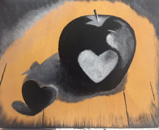
Keep Heart
Acrylic on Canvas

     This painting is one of my favorites.  It was created by using a grisaille under coating.  Grisaille is a technique used by many great artists such as Rembrandt in order to create photo realistic paintings.  To start a grisaille undercoat, the subject is painted in shades of grey.  This will produce a greyscale version of your subject.  Once this is accomplished, a layer of gloss medium or varnish is applied.  Once dry, begin adding layers of color, and highlights.  Finish by adding a final layer of gloss medium.  The end result is as pictured above.  Below are examples of the process in steps.  I really loved learning this technique and it will be one that I use for future paintings as I am really pleased with the results. 

Subject is painted in shades of grey creating a grisaille undercoat.

The background has been added also in shades of grey. Once all shadows have been added, a layer of gloss medium is applied and allowed to dry.

Layers of color and highlights are added on top of the once greyscale image.

White highlights are added and background is blended to look more realistic.

Finally a layer of gloss medium is added and the painting is complete.


Wednesday, October 5, 2016

Space

Starry Night Kiss
Space Painting
September 2016
Ink on Plexy Glass

     So far this is my favorite painting involving the concept of "space." This painting was inspired by two of my favorite things, Vincent Van Gogh's "Starry Night" and the "Kiss the Girl" silhouette from "The Little Mermaid." Here I attempted to use the idea of space to create three distinct layers which, when stacked together would combine to form one very unique painting.  The background, which depicts a scene from "starry night," was painted using many small lines in an attempt to show the rhythm and movement of waves. The same technique was used on the stars in order to represent their brightness shining in the night.  I used the same technique on the very top layer in order to tie it all together with the background.
     I attempted to use elements such as line, shape, texture and color  along with rhythm and movement to bring this painting to life.  For me this painting is more than just combining two well known scenes, it also represents the feelings that go into a first kiss.  I think the waves really help represent the nerves and rollercoaster of emotions that one may be feeling when the anticipation is building until that first kiss is finally realized.
     When I see this painting the deep blues and whites remind me of the ocean which instantly makes feel calm and relaxed which is what I hope others take out of this as well.  It also helps to remind me of that special first kiss I shared with my true love and all the emotions that led up to that special moment.  Seeing the silhouette of Ariel and Eric in the boat also reminds me of my childhood and when times were a bit simpler.
    In creating this piece I was hoping to put a modern spin on a classic and well known piece of art. I think this is definitely a conversation piece and I can't wait to hang it in my home.  I feel that anyone that loves Disney's, "The Little Mermaid" as well as Van Gogh, will definitely like this piece as much as I do.

Concept Design
Starry Night Kiss

Concept Design Ink
Stand Out

Concept Design Acrylic
Blended

Concept Design Collage
Sunrise On A Paper Sky